A review on Amazon of my new novel, Attachment Patterns, starts like this – “This book is all that it says it is, well-written, emotionally charged, and a really good read” – and ends like this – “However, the cover is an absolute insult. My suggestion to the author would be to do your book a favor and give it a cover that it deserves”.
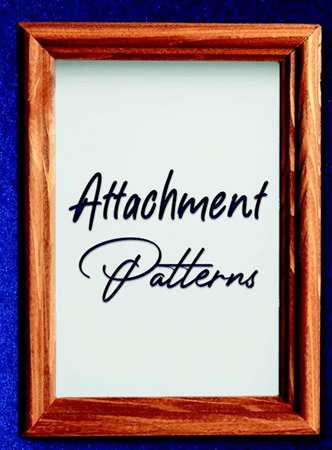
The cover. Ah, yes, the cover. Not quite what I’d hoped for or envisioned. I’m not any kind of artist but my protagonist in AP is. From early on I wanted to make him just that, an artist, and as I worked on the novel I did a lot of research into the world of “art”. (And you think the worlds of theatre, film and fiction are challenging.) Part of that research was studying paintings and finding artwork that resonated in the character and in the story I was telling. I even went so far as to put a painting/illustration at the end of each chapter. Call it an exclamation point. It never occurred to me that artwork posted on the internet, some of it hundreds and hundreds of years old, would be still be subject to copyright. Well, I eventually learned that it is, and I removed the images from the manuscript. Having said that, when it came time to publish I shared some of the images with the publishers thinking that they could be the basis of the book’s cover. Nope. Again, copyright issues – way too expensive. Yes, but the idea, an artist, and the pictures and paintings in his head? For some reason, it didn’t seem to fly. The first cover sent to me was simply the title of the novel set against a red backdrop. I thought we could do a little bit better than that. Attachment patterns are about patterns of human connection and in the novel, the artist-protagonist’s patterns of connection have broken. I suggested that perhaps the empty, broken frame of a painting could symbolize that. What I didn’t notice in the cover image they eventually sent me was that the frame was not broken anywhere. I also didn’t realize that the white background within the frame would look like an unblemished canvas – meaning the frame didn’t look empty.
We now have a book cover no one seems to like. I’ve been told it’s stark and barren and suggests nothing of the story on the pages within. Some people have even said to me that at first glance they’re not even sure it’s a novel. Can the cover still be revised in some fashion? If so, in what way? I’ve suggested that perhaps an artist’s palette and brushes and swirls and flecks of paint might be added so we’re given the impression the letters – Attachment Patterns – have just been painted by the artist-protagonist. But at the end of the day does it really matter all that much? This is from a cousin of mine.
“Imagine a beaten-up old, unmarked trunk full of magical dust. It doesn’t look like much but people who open the lid will be rewarded with priceless treasures.”
I hope so.

Leave a comment